neptea
BACKER
Bio
I love video games. :) I also love wrestling and cats. I'll only post reviews here as I play/replay stuff, so they're fresh in my mind.
Review guide:
The criteria I rate with are as follows:
- Visuals (graphics, art direction, color design, UI)
- Sound (music, voice acting, sound effects)
- Story (plot, writing, characters)
- Gameplay (mechanics, controls, level design, systems)
- Worldbuilding (lore, environmental design, atmosphere)
- For stuff that doesn't really have a story (i.e., Tetris or Donkey Kong Country), I instead rate replayability. These types of games are all about hooking you on the gameplay/keeping you engaged, so I feel that it's fair to rate that.
I give a short number review before going in-depth for these sections.
Badges
![]()
Gone Gold
Received 5+ likes on a review while featured on the front page
![]()
Adored
Gained 300+ total review likes
![]()
Trend Setter
Gained 50+ followers
![]()
Well Written
Gained 10+ likes on a single review
![]()
Best Friends
Become mutual friends with at least 3 others
![]()
Loved
Gained 100+ total review likes
![]()
Listed
Created 10+ public lists
![]()
Donor
Liked 50+ reviews / lists
![]()
3 Years of Service
Being part of the Backloggd community for 3 years
![]()
GOTY '21
Participated in the 2021 Game of the Year Event
![]()
Popular
Gained 15+ followers
![]()
Liked
Gained 10+ total review likes
![]()
GOTY '20
Participated in the 2020 Game of the Year Event
![]()
Noticed
Gained 3+ followers
![]()
On Schedule
Journaled games once a day for a week straight
Favorite Games


070
Total Games Played
027
Played in 2024
449
Games Backloggd
Recently Played See More


Recently Reviewed See More
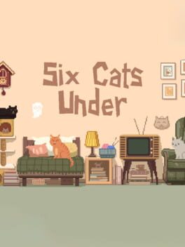
Six Cats Under is a short point-and-click puzzle game made as a game jam. You play as an elderly lady who’s just met an untimely demise, and must now use her limited ghost abilities to help her cats escape the apartment. Despite this slightly morbid tone, though, the game shines with a lighthearted sense of humor and a very cute presentation.
Your entire goal is to figure out which items you can or can’t interact with. You must then use them to gain your cats’ attention and influence their actions, causing a chain of events that will ultimately lead to the opening of the front door. The entire apartment, and the kitties themselves, essentially serve as one big puzzle.
This puzzle is much more difficult and intricate than I’d expected, too; I honestly had a tough time figuring out a few of these interactions. I definitely appreciate the creativity and complexity of the gameplay, but I do wish these parts were a bit easier so that the entire game didn’t drag itself out as much. I think it would help a lot even just to have a clearer way to tell what you can and can’t use. Over half of the items in the apartment serve no purpose, but you won’t actually know which ones matter until you’ve clicked through all of them. Sometimes it feels like you’re stumbling around blindly trying to figure out the next step. I was especially lost at the beginning.
Despite these flaws, the gameplay still has a really neat idea behind it and mostly satisfactory execution. It’s very rewarding to see the cats interact with their surroundings and the amazing animations that come along with that. And I still enjoyed most of the answers, anyways - it was just a select few that I took issue with. So I still think the creators did a good job!
As for the story, it doesn’t really extend beyond your singular goal. The game is about 15-20 minutes long, most of which is dedicated to figuring out the puzzle. It’s understandable, since again, this was made for a game jam - but it unfortunately still means that there wasn’t enough time for things like worldbuilding or plot progression. All you can really discover is a bit of information about each car by clicking on them. The apartment is a studio, so there’s not much room to fit items that would give more personality to our protagonist or her pets, either. There are definitely a few nice details - portraits of loved ones hanging on the walls, a yarn basket - but it’s pretty limited. One of the best details though is the main menu, which shows a framed picture of the elderly lady holding one of her cats.
Really, what makes everything work for me with Six Cats Under is the presentation. Even though it’s a simple setting, the apartment is still very visually pleasing. The pixel art is just so beautifully done and detailed. Its main color scheme is composed of warm browns and yellows that are accented by dark green, creating a very cozy atmosphere. Plus the kitties are, of course, particularly adorable!
As for the audio, it’s also quite well-done. The looped song is both cheerful and relaxing, and thankfully just long enough that it doesn’t become annoying. Besides that, there are cute little sound effects to accompany you or the cat’s actions (my favorite of which are easily the meows.) It’s all perfect compliment to the adorable pixel art.
Overall, I definitely think Six Cats Under is worth playing. It’s fun and endearing, and has a very strong vision for what it wants to accomplish. I honestly did feel bad about having to scare virtual cats in order to manipulate them, then allowing them to wander out of your apartment aimlessly - [SPOILERS] not to mention boiling your pet goldfish in the process [END SPOILERS]. But if you don’t think about it too hard, it’s a really delightful experience.
Visuals: 4.5/5
Sound: 3.5/5
Story: 3/5
Gameplay: 3.5/5
Worldbuilding: 2.5/5
Overall Game Score: 3.5/5 [3.4/5]
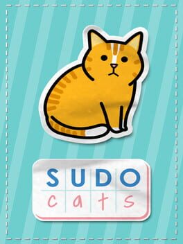
Sudocats is a charming Sudoku game with the unique premise that the numbers are replaced with drawings of cats. It’s a simple but well-executed idea, one that does exactly what it promises to do. There’s a high chance that you’ll enjoy your time with it if you particularly like brain teasers and/or kitties.
A big reason that I think Sudocats succeeds is its heart. It’s obvious that the devs enjoyed developing the game, and even more-so that they have a real passion for cats; it’s the complete antithesis to the soulless (albeit free) hidden object schlock such as 100 Asian Cats that I’ve covered in the past. Even if it’s not exactly an original concept, they took the time to make their product fun for players and full of love for felines.
In fact, Sudocats’ eponymous cats are largely based on the team’s own pets! This is definitely my favorite part of the entire game, as it made the atmosphere feel all the more cozy and lovingly-crafted. Best of all, after completing a set of three levels, you’ll unlock a picture and a small blurb about one of them that includes their name, age, breed, and personality. It’s honestly a great incentive to play through the entire game, at least for cat lovers like me.
The general art style is very cute, too! The menus are presented as an adorable notebook covered in cat-related stickers, along with an “adopt don’t shop” bookmark. The cats remind me of Neko Atsume a bit, with their round shape language, bold line art, and bright colors. They each have unique poses (and even facial expressions), which creates a great deal of variety amongst them - an important detail so that you can easily differentiate between them on the board.
Aside from the cats themselves, my favorite visual feature of Sudocats is definitely the player’s ability to customize their in-game look. There are a variety of board colors and patterned, textured, or solid backgrounds to mix and match. I only wish that your choices carried over between levels, so that you wouldn’t have to change it back every time if you found a particular combination you liked (I largely preferred the darker palettes as it’s easier on the eyes.)
Along with this visual freedom, there’s also an in-game option to easily switch between the three music tracks. The first serves as the main menu’s theme as well; it’s a jaunty piano tune that, while definitely a cheerful introduction to the game, is ultimately my least favorite of the three. The other two tracks are similarly led by piano, yet they’re much more low-key and relaxing - a style that I feel suits Sudocats’ cozy atmosphere much better. Each of them are licensed music instead of original content, but I think the team at least did a decent job with their selections.
As for the gameplay, well… if you know how to play Sudoku then you’ve already got it! There are three different stages of puzzles, each with nine levels - 4x4, 6x6, and 9x9. I found the 4x4s and 6x6s painfully easy, as I’m sure most people with any Sudoku experience would. Still, these simpler levels serve as a good introduction if you’re unfamiliar with the puzzle format. Another thing to note is that you actually have every single level unlocked from the very beginning (there’s even a ‘random level’ button), so you could entirely skip the easy ones if you wanted to! The 9x9s are definitely the most fun and challenging, but I don’t begrudge the others for being here. I could especially see a child engaging with and learning from them.
Aside from the cat blurbs I mentioned earlier, you actually unlock one other thing while you progress. This time, it’s an instructional guide on how to introduce a new cat into your home when you already have resident cat(s). You’ll unlock each step over the course of the first ten levels you complete. This obviously won’t be as fun of a reward for a lot of people, but I think it’s really cool that the team went out of their way to teach pet owners something beneficial for their current and future kitties.
Of course, there’s only so much enjoyment you can get out of Sudoku at the end of the day. Fans of brain teasers will surely play it more often - doubly so if they’re a cat person - so it really just depends on each player’s taste. Either way, the inclusion of daily and randomly-generated levels means you’re always guaranteed a new puzzle, giving you infinite value from this two-dollar game! That’s a big point in its favor.
It’s just so nice to have a casual, cute, and well-made puzzle game like this on my Steam, waiting there for whenever I feel like picking it back up. It’s free from the pesky ads plaguing similar phone apps, and even has its own unique little gimmick - better yet, a gimmick based on something I personally love!
So, even though it may not have the most original concepts, Sudocats builds upon its foundation in some very charming ways. I’m sure I’ll boot it up every once and a while to play a few levels. It’s easily worth the price, and if it sounds interesting to you, I’d definitely recommend checking it out. I have no doubt you’ll enjoy it!
Visuals: 3.5/5
Sound: 3.5/5
Gameplay: 4/5
Replayability: 3.5/5
Overall Game Score: 3.5/5 [3.6/5]

Assemble With Care is one of the most relaxing games I’ve played in a long time. It’s got satisfying gameplay, stunning visuals, and wonderful voice acting. Everything about it oozes with charm, in a way where I can just see how much love went into its development. For only being an hour and a half long, it definitely leaves a lasting impression.
We play as a traveling repairwoman named Maria, whose most recent stop has taken her to a European city named Bellariva for their annual food festival. While there, she finds repair jobs to make pocket money - and she ends up meeting a cast of lovable characters, each with their own sentimental items that need fixing.
A big part of Assemble With Care’s story focuses on that exact sentimentality toward beloved items, and the personal stories we attach to them. The very first job Maria takes on is making the tape player owned by a girl named Izzy play again; we learn afterwards that it holds a recording of Izzy’s deceased mother singing her a lullaby. Each and every item we work on throughout the game is similarly important to its respective owner, for one reason or another.
Little Izzy is the first of our side characters, followed by her father Joseph, Bellariva’s mayor. They have your classic “busy dad” arc; he throws himself into his work because of the sadness over losing his wife, but his relationship with his own daughter is suffering because of it.
The second half of the story is made up of Carmen and Helena, a pair of sisters struggling to maintain their long distance relationship during financial difficulties. Carmen is warm and a bit absentminded, while Helena is the aloof and responsible older sister. Carmen owns a humble Bellarivan cafe that’s, unfortunately, not making any money. She calls Helena hoping to borrow the entry fee for the food festival (and by extension, the contest held during to be declared the best food in the city.) However, this isn’t the first time she’s asked for money, and Helena decides to visit from the big city to discuss things in person.
Assemble With Care’s overarching theme focuses on the reparations of these familial relationships as much as the items themselves; in fact, Maria must learn to address her emotional distance from her own parents after having left to travel. But this pinpoint focus on blood family is, unfortunately, the weakest part of the whole game for me. Not because it’s badly written, although I do feel the last few acts are a bit rushed and could’ve used one or two more levels. It’s because, as a queer person, I simply don’t believe that blood relatives inherently deserve to be called family and receive your unconditional love and support.
Izzy and Joseph, Carmen and Helena, both pairs truly love each other and work through their differences - but that’s not always how it is in real life. I find plots that hammer home how important family should always be just don’t resonate with me. Sometimes it’s genuinely better to not have those people around.
Another gripe I have on the story side of things is Maria herself. She’s a likable character, but she rarely feels like more than an observer who just happens to witness the healing of these relationships. We’re not even present when either pair finally make amends - we just hear about it later. I would’ve liked for her to be a more active participant in not just the gameplay, but the world unfolding around her.
All of that being said, I still do like the cast in Assemble With Care, and I think a big reason for that is the voice acting. Each character not only has a distinct and memorable voice, but the VAs do a great job of conveying emotion in their performances. Where the story is a bit generic and predictable, the VAs still manage to inject life into it; they’re what really make everything feel believable.
Just as good, if not better, is the music. In fact, I think this is one of my favorite soundtracks I’ve heard in a while! It beautifully captures the coziness of small town vibes, and maintains the perfect relaxing atmosphere throughout the entire story. Many pieces are led by keyboard, and there’s occasionally an acoustic guitar; in fact, a lot of them sound like what you might hear played at a coffee shop somewhere just like Bellariva.
The art is also absolutely amazing, presenting the narrative through a unique, storybook-like lens. ‘Cutscenes’ that play before and after a repair are actually a series of ‘pages’; each ‘page’ shows off a piece that truly feels like you’re looking at a real-life painted canvas. The color palettes are warm and full of life, especially against the standard stark white background of the ‘page’. The presentation makes Bellariva feel like a real place you’d dream of visiting one day.
That’s not to mention the stunning character art! Each cast member has an exceptional design, with bold shape language and amazing color combinations - the latter of which connect them directly to their respective family member. Joseph and Izzy’s clothing share a rusty red and sky blue, while both of their neck accessories (a tie/headphones respectively) are pale yellow. On the other hand, Carmen wears bright yellow and warm shades of blue, while Helena wears more cool, chic blues and chartreuse; these similar-but-different tones perfectly convey their familial closeness yet totally opposite personalities. Carmen also has a striped towel over her shoulder that matches Helena’s shirt closely!
The repair sections are possibly even better-looking, bringing motion to the game’s beautiful art style. Each level has a unique background that matches whichever setting Maria is in, from tiled floors to a tablecloth covered in Izzy’s doodles. The colors are, of course, as consistently wonderful as ever - and another specific standout here is the detailed lighting. In scenes taking place outside, the entire screen is well-lit, with only a few shadows casted here and there. If she’s inside, she’ll work in the light from each setting’s unique window. You can clearly make out the shadows left by not only these windows, but by nearby plants as well. It all adds so much to the atmosphere.
Even Assemble With Care’s pause menu is aesthetically considered, taking the form of a clickable coffee cup in the corner (or a half-eaten cookie in the epilogue!) But my favorite part is easily the texture work. The objects look as if they’ve been painted with a brush; their textures move back and forth slightly to bring life to them. You can clearly tell plastic from painted metal, and painted metal from unpainted.
The gameplay itself is simple, but very effective. It’s always clear what your next step is for a repair; the satisfaction instead comes from how tactile it feels to actually do all of it. Unscrewing screws, removing parts, connecting wires - it feels as if you really are Maria, with her practiced ability to make things tick again. Personally, I preferred this method to a more puzzle-heavy alternative. I was worried before playing that potentially complex mechanics based around a real-life skill (which I don’t possess) would be too difficult for me to engage with.
The best part, though, are the little interactions you or the other characters may have with an object while finishing up a job. It feels so rewarding to get these moments of flavor and character building. After you repair Izzy’s tape player, you get to hear her mother’s lullaby. While putting together a neon sign for Carmen’s restaurant, you can choose between three foods to add to it (a pizza slice, an ice cream cone, and a margarita.) You even get to play a quick and easy little minigame on a GameBoy equivalent after fixing it. There’s even more, but you get the picture, I don’t want to spoil all of them!
I also really appreciate the wide range of objects and types of repairs you’re doing. Some jobs are for antiques or family heirlooms, while others are for electronics. There are even fake brand names given to each object, displayed at the top of the screen after finishing a job.
There’s a surprising amount of good worldbuilding moments in Assemble With Care - even if it’s not very intricate. For example, the game almost never discusses money directly. All we know is that Maria needs some to attend the food festival, that Joseph will pay Maria for her work, and that Carmen’s business is failing. Yet, we never see Maria charge a client on-screen. These interactions are simply left out. This omission of the finance talk makes the game feel all the more cozier; you just don’t have to think about capitalism more than needed for the sake of the story.
To wrap up, Assemble With Care may not be a perfect game, but it has many strengths. It’s fun, it’s relaxing, it’s heartfelt, and it’s unique. The presentation is immaculate, and the gameplay is close to perfectly executed. I came here for a casual, calm experience, and that’s exactly what I got.
Its only real blind spot is a slightly bland story that doesn’t personally connect with me - still, it very well could you. It’s worth playing either way in my opinion, though, as its pros heavily outweigh any cons. This is simply one of the most charming games I’ve played in a long time.
Visuals: 5/5
Sound: 5/5
Story: 3/5
Gameplay: 4.5/5
Worldbuilding: 3.5/5
Overall Game Score: 4/5 [4.2/5]