

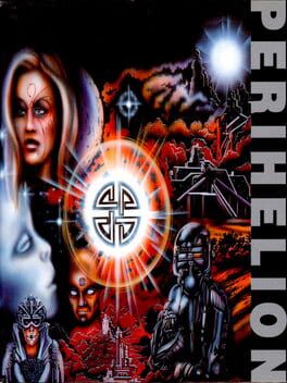
The six characters under your control in this visually exotic RPG have been genetically engineered so as to be resistant to a virus which has been spread by an evil being in the futuristic land of Perihelion. The character races include Bionecrons, Symbions and various cross-breeds. The gameplay is controlled from a set of initial icons, with each character's vital statistics accessible from this screen as well as inventory, combat and travel options. Large distances can be traversed simply by issuing directions and letting the characters follow them. The cities have very detailed buildings, but there is little variety between them. Combat is a regular feature of the game, although its occurance is always planned and controlled.
Reviews View More
Vibe is unequivocally the most important part of a video game. The game can be an incompetent car crash held together just enough to run on someone else's device, and if the vibe's good enough, it doesn't matter. Contact and Evergrace are two of my favorite games of all time and those games are a chore to play. Perihelion is such a pain to play that the vibe, as great as it is, makes this game one that I couldn't even recommend to check out what good the game has.
There is a narrow black box at the bottom of the screen, not dissimilar from a news ticker. Dark orange text scrolls to the left across this ticker in a single row. In a majority of cut-scenes, overworld exploration, and combat, this is the main way the game conveys information to you. This isn't an idea without precedent, the Amiga port of Eye of the Beholder also has a similar presentation, except the text in that game is much larger, the font color contrasts against the ticker background, and there's two rows of text, most of which is dedicated to one sentence blurbs like "you stepped on a kobold". You have to read 80 percent of this game's text in the same way you would read about stocks on CNN, and it's not even easy on the eyes to do so.
This game wouldn't be fantastic even if they used traditional text boxes, and there are conversations/terminals/etc that has a box that uses slightly more of the screen, but this design choice buries the game alive. Imagine trying to play Chrono Trigger, except every new word takes 3 seconds to display on screen, and you had to squint. It's not like they didn't have the space for more text either! All the menus in this game are overdesigned to the point of hurting the overall experience. Open up the inventory and taking up a full 3rd of the screen is a random dude frozen in carbonite, while switching weapons requires pressing an up or down button and cycling through the one you want, one by one. In combat, there's a minimap, and a metallic face wincing in agony takes up more space than said minimap. Even the compass in the corner uses orange on orange to display N/W/E/S and the font they use takes a second to read what direction you're facing. There are occasions where the game will overlay the screen with a red tint, and at that point the game is less playable than any North American Virtua Boy title. It's not unintuitive design, it's outright hostile design.
Combat's also a low point in the game. There are notably less combat sections than most RPGs from around this time, which is a blessing because it's somehow worse than having to suck this CRPG plot through a straw. There's zero music during any combat encounter. The overworld dungeon design and character portraits look fantastic for the Amiga. The combat sprites look so bad, I regularly had a hard time telling my party apart. There's no scrolling when a party member moves from tile to tile, instead going for an abrupt screen shift that makes trying to get into position disorienting. Characters can perform actions based on how full another orange bar is at the top of the screen. This is supposed to be a visual interpretation of a static number, but instead they'd prefer to obscure even more information from the player. The speed of combat is agonizingly slow, and the encounters are large, both in the amount of enemies you have to fight and the combat arenas themselves. Most rounds consist of trying to pick at whatever grey blob that's antagonistic towards your not space marines with pellets. There's no shooting around corners. Friendly fire is on for every ability. There are a limited amount of spells, and most of them are variations on "zap". When the gears are turning, it's less engaging than its CRPG peers, and those gears turn very slowly.
All of this is in support of what amounts to "an early version of the direction post-ironic Warhammer 40k would take". The art and worldbuilding of Perihelion are good, if not great given the context. It's wasted on a story that's as ambitious as most D&D games from around this time. I don't think I could describe any character without describing their role in the game. It's a world filled with Psychodivers from Shin Megami Tensei 1. It's not even a game I can suggest looking up a longplay of to see the 5-10 cool moments of the game (like the ending, which has stuck with me since I've played this game two years ago) because of how hard it is to real the screen. If this game was canned and they threw all of the ideas they had into a RPG splatbook it would have stolen Dark Sun's lunch money. As a 10-15 hour RPG, it's miserable.