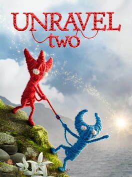
There's a strong co-op experience in Unravel Two's gameplay, but every aspect of the presentation is determined to obscure that fact.
The visuals go for a realistic style which constantly works against the visual clarity needed for a co-op platformer. Frequently, my girlfriend and I were just not on the same page at all, each of us having a different understanding of what aspect of the environment was foreground or background (sometimes we were both wrong). It may be possible to execute an art style like this and not create so much ambiguity, but if so Unravel Two is a million miles away.
Why does it go for this style? For some reason, Unravel Two fancies itself a cerebral experience, high-art. That's why the level names all have "poetic" secondary titles against a backdrop of (laggy) ocean waves, and why there's an incomprehensible story of shadowy children being chased by... zombies (???) going on in the background. These elements only serve to annoy and illuminate little about the universal message of co-operation Unravel Two is supposedly aiming for.
It's pretentious, and I hate to make that accusation. I think people can be too willing to throw that label around whenever a piece of art dares to test patience or try something experimental, but Unravel Two does neither of those things. It's just a bad, clumsy work of art overlaying a decent co-op platformer.

mayagirli
26 days ago