

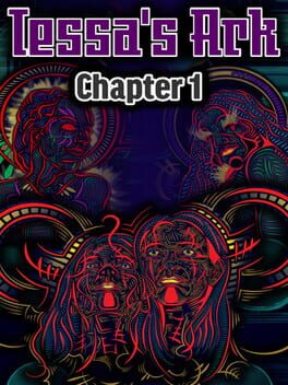
Tessa's Ark
released on Jul 13, 2017
A Sci-fi RPG set in a world where humans have shed the limitations of the corporeal body to inhabit existence as beings of pure thought. Solve puzzles to unlock the secrets of the digital reality.
Reviews View More
Playing this as a game design student was incredibly painful. Playing this as an obnoxious artist was incredibly cool. However, because this is a game, the issues rooted to its design take precedent. Off the top of my head:
- currently, text is progressed using an arrow beside the text box. When the dialogue is finished, the arrow disappears. The button you're meant to click to proceed is half the size of the arrow and is tucked away in the corner. That button can exist in the corner during the conversation, since it can be used to skip dialogue, but at the end of the conversation, it should take the place of the arrow (or let the arrow act as the button itself) so the player can quickly continue the game instead of having to look for the button.
- there is sooo much dialogue explaining the game's puzzle mechanics, what the different colors do, the goals, and what the penalties are before the player even gets the chance to look at the board. This is not engaging.
- immediately after I finished reading through all the explaining, I forgot what the colors did. Introduce your mechanics one by one, so the player can naturally remember what the colors mean, or use the visual design to hint at what the colors do. The colors represent mathematical functions. Math symbols are universal. Please make use of them.
- After the level is beaten, you get a notification telling you that you beat the level. Then the notification disappears and the game board is not only still on the screen, but you still have control over the player character. The game should auto progress after beating a level, instead of requiring the player to click that same corner-hidden 'next' button.
- too much text in a text box at one time! Two (physical, not sentence) lines visible at a time per box is the gold standard. Three is okay if done rarely. Four is really pushing it. Five is way too much. Splitting up dialogue text into multiple screens/scrolls also allows you to give lines emphasis. Big box of text scary.
- randomly, in the middle of a level I was playing, I got a game over. I was genuinely confused, because I had no idea what I did wrong. Turns out using one of main locomotion mechanics (a teleporter) drains one of the character's health. I didn't know this because (I assume) it was explained in a block of text but ALSO because the ping that the character's health depleted was... tucked away on the edge of the screen and did not appear with a sound effect or anything.
And that's just what I can remember. Note: I did not finish the game. I gave up during that level I got the game over on after trying it a few more times because I didn't remember how the mechanics work (because they were told, not taught) and so I was brute-forcing everything. That being said...
Bonus points for outstanding and incredibly creative visual style. It was a bit off-putting at first but I really came around to it. The colors, the details on the talk portraits, it's so unique and incredibly memorable. I'm a sucker for the 90s-2000s UI of the puzzle sections too. It really felt nostalgic.
This game is one of those that has a lot of unmet potential. I could see this being a very good and fun puzzle game, but not at all in the state it's in now. The absolute first thing to fix should be the way the mechanics are introduced, because that ultimately ended up being the thing that caused me to drop it.