Visuals and/or Lighting I hate
I'll think of more later
Fuck how these games look
Fuck how these games look
3 Games
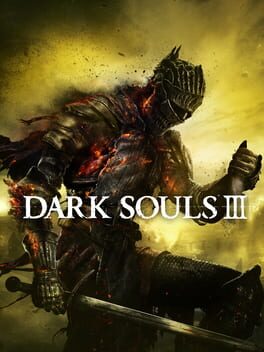
Washed out
Piss Filter
Lacks saturation
A lot of UI elements are unusually ugly compared to the rest of the superseries
DS1, BB, Sekiro and Elden Ring all make use of colours and lighting so much better in their own ways.
I breathe a sigh of relief whenever I visit Archdragon Peak because I can look at some beautiful sky again.
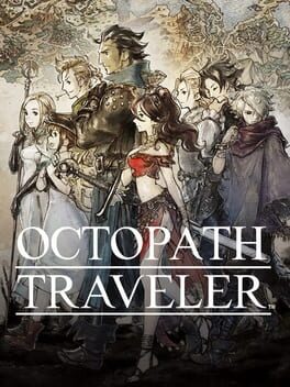
I don't hate HD 2D but this game is way too fucking overkill with its "bloom"-like effect and god there's just a lot of lack of saturated colours in this game.
what we've seen of DQ3 remake is hands down a much better approach to HD 2D visually. Live a Live looks great as well and OT2 seems to be an improvement, I just always thought OT1's visuals were overrated
https://www.backloggd.com/u/PansyDragoonSaga/review/120733/
This review illustrates why I've always hated this game visually perfectly lol
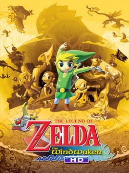
Similar lighting issues as the above
A lot of the colour from the original doesn't feel like it has a chance to pop out in this remaster
Also while I like the overall art style I was never crazy over Toon Link's character design I think he looks ugly
A lot of the colour from the original doesn't feel like it has a chance to pop out in this remaster
Also while I like the overall art style I was never crazy over Toon Link's character design I think he looks ugly