Worst video game box art
Been seein a few list talkin about the best game box art but what if they was one for the worst of the worst
Feel free to add suggestions
Feel free to add suggestions
26 Games
Let's get this one out of the way first since it's the most iconic example of bad box art
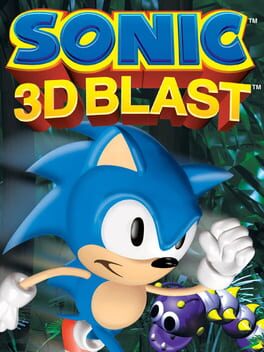
All American nes mega man box arts are counted here too let's also throw in sum of the early 2000's european box arts too mm z3 box art my beshited
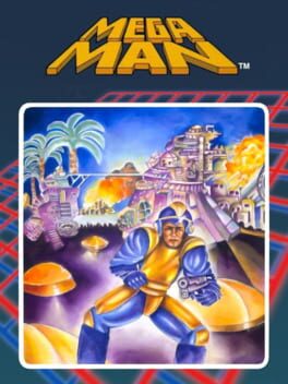
All American nes mega man box arts are counted here too let's also throw in sum of the early 2000's european box arts too mm z3 box art my beshited

Lazy ass cover for a lazy ass game
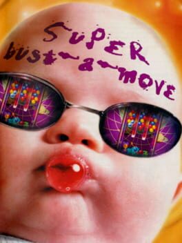
Added for wollom
Real&True

Adding this here cuz Japan got this cool ass artwork for it instead of having the most lazy ass box art is literally just the title an that's it
Take a look at the european box art you wont regret it
Take a look at the european an japanese box art then take a look back at the american an then compare them
Added for stale_cheeto

U.S. box art
Added for FallenGrace
Added for FallenGrace
Added for cowboyjosh
Just look at the Japanese cover an this just speaks for itself

If yknow yknow
Add for HylianBran
Added for chandler
Added for Fizza
Added for PolarDraws
Added for SmashBlack
24 Comments
megaman lmfao
LOL I never knew about the 3D flickies island one that's funny
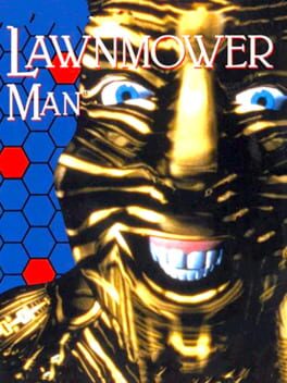
the lawnmower man box art is fucking hilarious
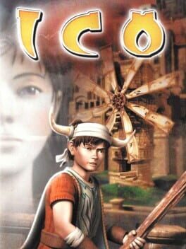
The US cover of Ico which is on here is just hideous to me.
My suggestions:
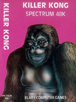
Killer Kong
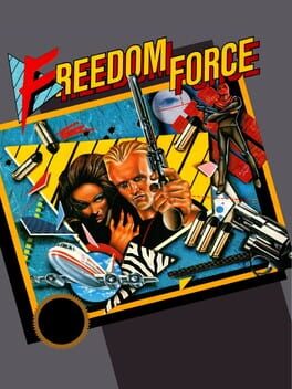
Freedom Force
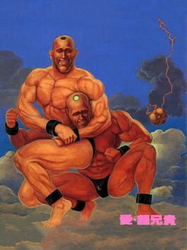
Ai Chou Aniki
There's also quite a few candidates on my Real People list but I'll leave it up to you which ones you like best/least.
Killer Kong
Freedom Force
Ai Chou Aniki
There's also quite a few candidates on my Real People list but I'll leave it up to you which ones you like best/least.
@cowboyjosh holy shit that list is great
these box arts aren't featured on here but I wanna give a shoutout to the weird European box arts for Mega Man Zero 2, Mega Man Zero 3, Mega Man X8, and some of the mega man battle network games. Mega Man Zero 3 is the best one since it's just the Japanese box art but redrawn in mspaint for some reason. Except somehow they misunderstood this weird lens flare thing in his eye as being his iris so he's cross-eyed. Again these aren't on Backloggd but I love them so I figured I would point them out anyway.
Yakuza 3 us box art is on here and it's a classic.
Strider us box art is another classic but somehow we still don't have that one. I should be happy about that but I really love the us box art so it's a downside in my book. Same story with Dino City for super nintendo.
The US Yakuza box art isn't that bad but I really really love the Japanese one so I count that.
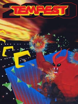
Tempest 2000 DOES actually have a terrible god awful shitty box art so I think that one does actually qualify for this list.
Wonder Boy in Monster World isn't quite as bad but it's still pretty damn bad.
Yakuza 3 us box art is on here and it's a classic.
Strider us box art is another classic but somehow we still don't have that one. I should be happy about that but I really love the us box art so it's a downside in my book. Same story with Dino City for super nintendo.
The US Yakuza box art isn't that bad but I really really love the Japanese one so I count that.
Tempest 2000 DOES actually have a terrible god awful shitty box art so I think that one does actually qualify for this list.
Wonder Boy in Monster World isn't quite as bad but it's still pretty damn bad.
@HylianBran lol completely forgot about sum of the early 2000's European box art for mega man an they really bland font they use for them gotta update the note for the mm entry now lol
Also yeah that european box art for z3 is amazing crazy how they fucked it up
Also yeah that european box art for z3 is amazing crazy how they fucked it up
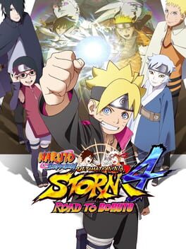
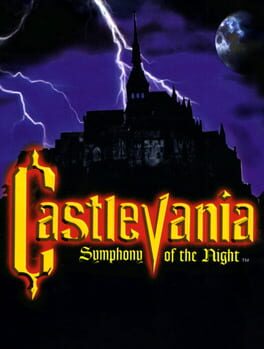
why naruto and castlevania
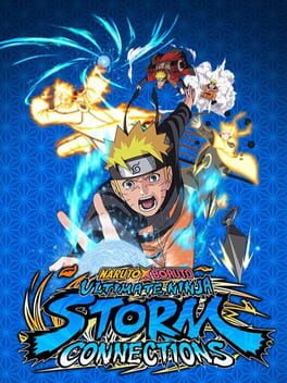
@samambaia reason why i got them there is cuz wit the storm games they look incredibly lazy like storm 4 has it's og box art in the background makin it look is in a the middle of a power point transition as for storm connections just think slapping pngs of naruto doin a rasengan which blue wit completely blue background an a blue color for the storm connections title is again pretty lazy an for castlevania i just think it's crazy that the u.s. realease got sumthin that looks like a stock image compared to the beautiful art that the european an japanese realeases got shoulda prolly specified that
I probably have bad taste or something but I don't think the Armored Core 2 boxart looks bad at all; a bit visually dated yeah, but it's still pretty eye-catching if you ask me.
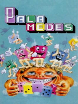
As for my own suggestion, Palamedes is one that's lived rent-free in my head since the moment I first saw it XD
As for my own suggestion, Palamedes is one that's lived rent-free in my head since the moment I first saw it XD
seeing armored core 2 and tempest 2000 and scratching my head in confusion until the scalp becomes raw
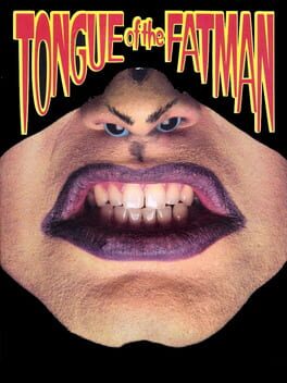
and no tongue of the fatman in sight...
and no tongue of the fatman in sight...
also the phalanx cover is goated. the publishers were brilliant because they knew the goofy ass banjo man would make the game - an unremarkable shmup in reality - more memorable. it worked
This comment was deleted
deus ex invisible war
a rare instance where a western game has a better japanese box art
a rare instance where a western game has a better japanese box art
I love how the box art for Naruto UNS Connections has the same art of Naruto front in center that's in the background of the Naruto to Boruto box art.
*Road to Boruto
I've personally always found the God of War 3 and The Last of Us 2 box arts to be horrendous
And I'd recommend having a Master System game representing the whole library: they were mostly a white background with grids, and some... ClipArt/MS Paint-ass art pasted into it. Seriously, just google "master system box art" and choose one lmao
And I'd recommend having a Master System game representing the whole library: they were mostly a white background with grids, and some... ClipArt/MS Paint-ass art pasted into it. Seriously, just google "master system box art" and choose one lmao
Metal Gear Solid 1 lol, literally just the fucking logo plastered onto a white background.
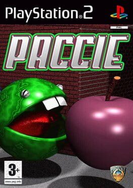
Might I suggest Paccie?
The Last of US Part II (PS4). When you look closely at the blood textures on Ellie's face, you realize it's just an ingame screenshot rather than something illustrated or pre-rendered. Prolly used photo mode and just called it a day lol
Mgs4 also has a really shitty US cover. I mean, it's not that bad really, but in comparison to the Japanese one it is.
Also I want to mention the US mgs3 box art because I've always thought it was really funny. Like, there's snake and he's in a tree but then there's eyes in the tree. I've also always thought that the leaves on the tree look like bats. I don't know why but I can't unsee it. And then there's like faded photo in the background. Like it's something alright.
The US ninja Gaiden box art is another favorite because of its silliness. Like, this is the most video game ass thing in existence. Like, there's a ninja layered over a fire on top of some city or something and then the BIGGEST ARCADE HIT at the bottom. Like whenever I see it I get the dumbest grin on my face I love it
Wollom
1 month ago